Painting Graphic Liner Art With Precision Pen Tools and Steady Surface
Use a 0.3 mm precision pen for bold, clean contours and a 0.1 mm for secondary details, switching to 0.05 mm for fine textures like wood grain or metal scratches. Keep your hand steady on a firm surface, applying even pressure to avoid blobs. Vary line weight to build depth, using thicker lines up front and thinner ones in shadows. Add highlights with a white gel pen on toned paper for punch-your next step activates even sharper control.
We are supported by our audience. When you purchase through links on our site, we may earn an affiliate commission, at no extra cost for you. Learn more. Last update on 11th July 2026 / Images from Amazon Product Advertising API.
Notable Insights
- Use a 0.3 mm liner for bold primary contours and a steady hand to ensure clean, defined edges.
- Apply 0.1 mm and 0.05 mm liners for secondary details and fine textures like wood grain or metal striations.
- Maintain consistent line weight by drawing on a firm surface with even pressure to prevent ink blobs.
- Create depth by varying line thickness-thicker for foreground objects, thinner for distant or light-facing elements.
- Enhance contrast on toned paper using white gel pen highlights and controlled linework for urban realism.
Pick The Right Ink Liners For Clean Lines
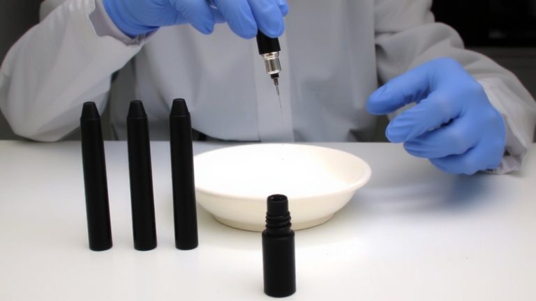
While nailing clean, professional-looking lines might seem like a matter of technique alone, the real secret starts with picking the right ink liners for the job. You’re using 0.3 liners for bold main contours-they define edges and bring shapes forward with punch. Switch to 0.1 liners when outlining secondary structures or refining focal details; they add precision without competing with heavier lines. Save 0.05 liners for fine textures like wood grain or seed patterns-they’re sharp, subtle, and perfect for surface depth. Match each size to its role: 0.3 for proximity, 0.1 for structure, 0.05 for accents. Keep your hand steady on a firm surface, applying even pressure to avoid blobs, especially with finer tips. It’s these choices that keep your work crisp. Don’t miss a post-follow Instagram to stay updated on liner hacks, tester tips, and new tool reviews that elevate your art.
Apply Line Weight To Build Visual Hierarchy
Line weight is your secret weapon for creating depth and directing the eye. You use line variation to build visual hierarchy, giving your art structure and focus. Apply a 0.3 ink liner for primary contours-its bold edge control grabs attention and defines dominant shapes. Switch to a 0.1 liner for secondary forms and focal points, adding contrast without competing. For intricate work like texture or fine patterns, the 0.05 liner delivers precision, enhancing depth cues subtly. Always vary line thickness strategically: thicker where objects are closer, thinner as they recede. This mimics real depth and guides perception. Keep strokes smooth and consistent to avoid distractions.
| Line Weight | Use Case | Visual Role |
|---|---|---|
| 0.3 mm | Main outlines | Strong edge control |
| 0.1 mm | Secondary shapes | Moderate line variation |
| 0.05 mm | Fine details | Subtle depth cues |
Define Light And Shadow With Contour Lines
Think of contour lines as the sculptor’s tool for shaping light and shadow on a flat surface. You control shadow depth by adjusting line weight-use a bold 0.3 liner for thick, dark contours where shadows gather, like the front edges of sunflower petals or the ax blade’s underside. Thinner lines, like those from a 0.05 or 0.1 liner, define areas hit by light, making them appear to recede. This contour variation mimics how light wraps around forms. On curved surfaces like spheres or cylinders, smoothly shift line thickness to suggest gradual shadow shifts without hatching. You’ll see it work when the petal’s curve pops or the ax handle tapers into soft shadow. Keep lines clean and deliberate, letting precision pens do the work. A steady hand and the right liner size give you control, turning simple strokes into dimensional depth, all through smart, intentional contouring.
Suggest Wood Grain And Metal With 0.05 And 0.1 Liners
When it comes to rendering realistic textures in graphic liner art, your choice of pen weight makes all the difference, especially when distinguishing between the rigid precision of metal and the organic flow of wood. Use the 0.1 liner to define the ax’s blade with sharp, clean lines that emphasize hardness and metal surface reflection. Add subtle parallel 0.05 liner strokes on the metal for dimension without overpowering. For the handle, outline with the 0.1 liner, then layer broken, flowing 0.05 lines to suggest wood grain texture. Keep pressure light to avoid bleed and preserve detail. Maintain line weight contrast by reserving bold 0.3 lines only for primary metal edges, letting wood stay visually secondary.
| Feature | 0.1 Liner | 0.05 Liner |
|---|---|---|
| Use Case | Blade contours, handle shape | Metal texture, wood grain texture |
| Line Weight Contrast | Strong, defining edges | Delicate, detailed accents |
Capturing Back-Alley Realism With Focused Contours
You’ve already seen how pen weight shapes texture, whether it’s the grain of wood or the gleam of metal on a tool, and now you can apply that same precision to urban environments where grit meets form. Focus on back-alley realism by defining uneven surfaces and utilitarian objects like bins with sharp, accurate contours. Use 0.3 mm liners for dominant edges, 0.1 mm for secondary shapes, and 0.05 mm for fine urban texture like rust or cracks. Build spatial depth by softening or breaking lines in shadowed areas, such as along a receding wall or bin base, to create atmospheric blending. Keep linework clean and consistent on mid-tone brown paper, avoiding shaky strokes. Controlled contour accuracy and varied line weights convey volume and lighting on man-made structures, enhancing realism without relying on washes or painted values.
Use White Gel Pen For Contrast On Toned Paper
A crisp highlight can elevate your entire composition, and that’s where the white gel pen comes in. When working on mid-tone brown paper, the gel texture of the pen glides smoothly to add sharp, opaque highlights where needed most. You’ll find it perfect for mimicking reflected light on urban elements like bins and walls, enhancing the sense of reflective surfaces without overworking the piece. Paired with fine liners, it gives you full control over tonal balance, letting you define form and depth without paint or traditional shading. The white gel layers cleanly, maintaining precision even in tight details, and stands out brilliantly against the neutral base. Testers noted its reliability in time-lapse setups, where clarity and speed matter. You won’t need heavy applications-a single pass often suffices. Keep it in your toolkit for instant contrast and luminous accuracy on toned surfaces.
Complete Urban Ink Drawings In A Time-Lapse Workflow
Tom Quigley’s time-lapse video captures the full creation of an urban ink drawing in just 90 minutes, using only fine liner pens on mid-tone brown paper-no sketching, no paint, just precise, deliberate lines. You see a spontaneous composition unfold, rooted in real Manchester back streets, where bins and brickwork gain form through layered linework. With varying pen thicknesses, he builds urban textures and atmospheric depth, guiding your eye through contrast and line hierarchy. A white gel pen punches in highlights, boosting dimension on the toned surface.
| Element | Tool Used | Effect |
|---|---|---|
| Contours | 0.8mm liner | Strong definition |
| Textures | 0.1–0.3mm liners | Fine detail |
| Highlights | White gel pen | Contrast pop |
On a final note
You’ve got this: use a 0.05 mm liner for fine wood grain, switch to 0.1 mm for bold metal edges, and keep your hand steady on a flat surface. Layer line weights to guide the eye, and add contour shadows for depth. A white gel pen pops contrast on toned paper. Work fast but focused-like a time-lapse-to capture gritty alley details with clean, sharp precision.