Best Colors for Beauty Salon
Choose Chantilly Lace OC-65 for walls to keep your space crisp and color-true, perfect for accurate hair applications. Pair it with Jojoba N390-3 on accent walls to calm nerves and lower perceived wait times, especially in reception. Add warmth using Good as Gold by Clare on trim or decor-just 10% for balance. Use Hidden Cove 0210 at coloring stations for a clean, reflective backdrop. Stick to 3500K–4000K LED lighting with CRI 90+ and eggshell finishes to reduce glare, maintain clarity, and simplify cleaning. Test swatches under both natural and artificial light to see how hues shift throughout the day, revealing how thoughtful choices shape client experience and brand impression.
We are supported by our audience. When you purchase through links on our site, we may earn an affiliate commission, at no extra cost for you. Learn more. Last update on 21st June 2026 / Images from Amazon Product Advertising API.
Notable Insights
- Chantilly Lace OC-65 provides a crisp, neutral backdrop that enhances hair color accuracy and cleanliness.
- Sage green tones like Jojoba N390-3 promote calm and reduce stress in reception and styling areas.
- Use the 60-30-10 rule: 60% neutral base, 30% secondary hue, 10% accent like Good as Gold.
- Hidden Cove 0210 offers a soft, true backdrop for color stations without distorting dye tones.
- Pair high-CRI LED lighting with matte or eggshell finishes to ensure true color and reduce glare.
What Does Your Salon Color Say About Your Brand?
Color speaks before a single word is exchanged, and the shade you choose for your salon walls sends a clear message about who you are as a brand. If you’re using Chantilly Lace OC-65, you’re telling clients your salon or spa values clinical precision, cleanliness, and high-end skincare-perfect for minimalist, hygiene-focused spaces. Aegean Teal 2136-40 suggests emotional balance and creative flair, ideal for hair studios centered on transformation. Urbane Bronze SW 7048 adds earthy sophistication, grounding your brand identity in nature-inspired luxury. Passionate HGSW2032? That bold berry-red screams confidence and modern elegance, perfect for brands embracing self-expression. Even a soft hue like Sugared Almond No.9913 conveys subtle playfulness and refined taste. Every color in your color palette shapes perception, influences mood, and aligns clients with your salon’s values-choose with intention.
Top 10 Paint Colors for Salons in 2024
While you’re updating your space to reflect the latest in salon design, it’s worth considering hues that do more than just look good-they shape the client experience. Aegean Teal 2136-40 by Benjamin Moore brings calming depth, perfect for creative, serene styling zones. You’ll love how Sage green Jojoba N390-3 by Behr infuses nature’s quiet elegance, reducing stress with its earthy tone. For a crisp, clean backdrop that makes hair color pop and keeps the environment feeling fresh, Chantilly Lace OC-65 remains a go-to white. If you’re aiming for modern luxury, Urbane Bronze SW 7048 by Sherwin Williams offers rich, earthy sophistication in reception or private treatment areas. And don’t overlook Good as Gold by Clare-a warm, mustard-inspired accent that adds joy without overwhelming. These 2024 favorites balance beauty, function, and client comfort seamlessly.
How Color Influences Mood in Salon Reception Areas
You’re setting the tone the moment clients walk in, and the right paint can make all the difference-especially when it comes to how they feel while checking in. In salon reception areas, cool colors like sage green and soft blue sets the tone for calm, lowering heart rates and making waits feel shorter. The right colors can make a space feel clean, inviting, and luxurious without saying a word.
| Color | Mood Effect | Recommended Use |
|---|---|---|
| Chantilly Lace OC-65 | Clean, professional | Walls in high-hygiene salons |
| Jojoba N390-3 | Calming, mindful | Entry accent walls |
| Sugared Almond No.9913 | Creative, upscale | Soft accent features |
Hidden Cove 0210 adds subtle depth, proving neutral doesn’t mean boring. Thoughtful color choices elevate the client experience from first glance.
Best Paint Colors for Hair Coloring Stations
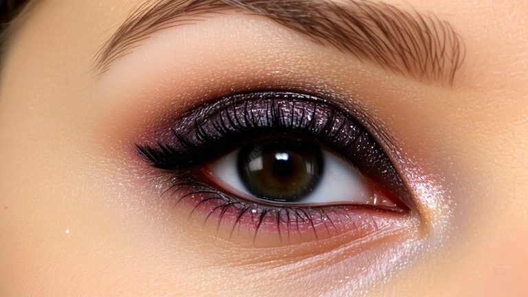
For accurate color matching and a professional finish, your hair coloring stations need walls that won’t skew perception-so stick with crisp white or near-white paint like Chantilly Lace OC-65 by Benjamin Moore, a top pick among salon designers for its true, neutral finish that prevents color distortion under both natural and artificial light. Choose colors carefully here-this isn’t the place for bold hues. A neutral color like Hidden Cove 0210 by Cloverdale Paint also works, offering a clean backdrop so you see true tones in every dye job. Lighter colors reflect light evenly, reducing shadows and eye strain during long sessions. Since dye splatter is common, go for high-gloss or semi-gloss finishes-they wipe clean fast and resist stains. Your clients trust you to get the colors right; your walls should help, not interfere. Professional precision starts with the right neutral color on the walls.
Apply the 60-30-10 Rule for Salon Interiors
When done right, your salon’s color scheme can quietly guide the client’s eye, set a mood, and reinforce your brand-all without saying a word, and the 60-30-10 rule is the go-to formula for getting it right. In salon interiors, use a dominant neutral like Chantilly Lace OC-65 for 60% of surfaces to create a clean, professional backdrop. Apply a secondary hue such as Sage Green Jojoba N390-3 on 30% of walls or furnishings to add calming, nature-inspired depth. Then, introduce accent colors like Good as Gold by Clare to 10% of the space-perfect for trim or reception desks-to add warmth and focus. This ratio guarantees balanced visual weight, just like modern salons using Hidden Cove 0210 with terracotta accessories. The colors you use should be tested under both natural and artificial light, especially when pairing bold accents like Passionate HGSW2032 with neutral bases.
Why Lighting and Finish Matter in Salons
While ambiance sets the mood, lighting and finish choices actually shape how color behaves in your salon, and that makes all the difference when clients are counting on flawless results. You need LED lighting with a CRI of 90+ for accurate color representation-critical when mixing hair dye or matching foundation. A correlated color temperature of 3500K to 4000K gives balanced, natural light that flatters skin tones and enhances both warm and cool hues. Place treatment stations near windows for natural light, but use diffusers to soften harsh shadows. Choose matte or eggshell wall finishes-they minimize glare and hide imperfections while being easy to wipe down. Avoid high-gloss finishes in service areas; they create reflections that skew color assessment. The right lighting and finish don’t just look good-they guarantee precision in every cut, color, and facial you deliver.
Coordinate Accents and Uniforms for Brand Unity
You’ll want your salon’s look to feel connected and intentional, so pairing your staff’s uniforms with key accent colors isn’t just smart design-it’s essential branding. When your Salon uses Chantilly Lace OC-65 uniforms with sage green walls, or charcoal uniforms with Passionate HGSW2032, you create a clear visual story. Your clients notice color continuity, whether it’s Aegean Teal 2136-40 in aprons and pillows or beige uniforms balancing vibrant Arizona Dust 2003-8A. These choices strengthen your brand’s role in branding by making the experience memorable. Apply the 60-30-10 rule: Urbane Bronze SW 7048 on walls (60%), beige furniture (30%), gold-accented uniforms (10%) for harmony. Uniforms aren’t just clothing-they guide perception, support professionalism, and tie every detail together. When accents and attire align, your Salon feels curated, intentional, and client-focused, reinforcing trust through consistent, thoughtful design.
On a final note
You’ve got this, and color helps you prove it-soft neutrals, warm taupes, and muted roses keep clients calm, while pops of emerald or blush add energy, just enough, not too much. Matte finishes resist fingerprints, LED lighting reveals true tones, and when your team wears heather gray with a coral apron, everything feels cohesive, clean, put together. Use the 60-30-10 rule, test swatches at noon and dusk, and watch moods lift, stays lengthen, reviews glow.